

Graphically Misleading: How Charts Lie to You in Ads, Politics, and the News
When Data Becomes Drama By Staff Writer Lisel B
In an age where attention spans are short and trust is shorter, graphs have become the go-to weapon for persuasion. They’re clean, authoritative, and—when manipulated—dangerously misleading. Whether it’s a car commercial boasting “industry-leading dependability,” a political campaign touting economic growth, or a news outlet framing a crisis, the graph is often less about truth and more about optics.
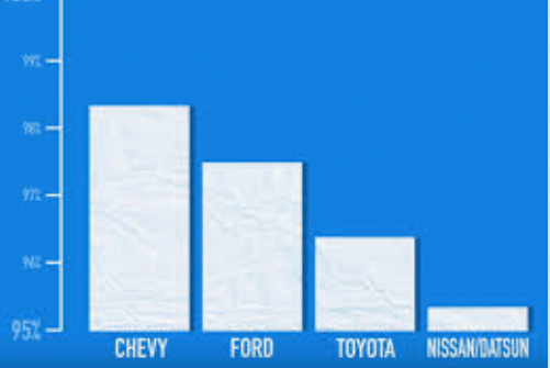
Take Chevrolet’s infamous “dependability” ad. The graph claimed their vehicles were more reliable than Toyota’s. But the visual told a different story: distorted axes, cherry-picked data, and a bar chart that looked more like a confidence trick than a statistical comparison. The message? “Trust us, we’re better.” The reality? “Trust us, we’re better at misleading you.”
Case Study: Chevrolet vs. Toyota – A Masterclass in Misleading Metrics
In 2019, Chevrolet aired a commercial claiming their vehicles were “more dependable” than Toyota’s. The ad featured a bar graph comparing dependability scores. But here’s the kicker: the Y-axis didn’t start at zero. Instead, it began at a high baseline, exaggerating the visual difference between the two brands.
- Actual difference in scores: Marginal
- Visual difference in bars: Dramatic
- Viewer takeaway: “Chevy crushes Toyota”
This is a textbook example of axis manipulation, one of the most common forms of graphical deception. By truncating the Y-axis, Chevrolet made a small statistical edge look like a landslide victory. It’s the visual equivalent of shouting a whisper.
Why It Works: The Psychology Behind Graphical Deception
Humans are visual creatures. We process images faster than text, and we trust visuals more instinctively. A graph feels objective—even when it’s not.
- Cognitive bias: We assume proportionality. A bar twice as tall must mean twice the value
- Authority bias: Graphs look scientific. We rarely question their construction
- Speed bias: In fast-paced media, we don’t have time to scrutinize axes or sources
This makes graphs the perfect Trojan horse for misleading narratives. They bypass skepticism and implant impressions before logic can intervene.
Political Graphs: Democracy by Distortion
Politicians love graphs. They’re the perfect tool for turning complex issues into digestible soundbites. But they’re also ripe for abuse.
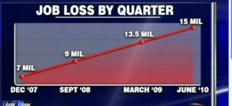
Example 1: Job Growth Under Administration X
A campaign ad might show a steep upward line, suggesting explosive job growth. But look closer:
- X-axis: Only includes months after a recession rebound
- Y-axis: Starts at a low baseline, exaggerating growth
- Missing context: No comparison to previous administrations or global trends
Example 2: Tax Cuts and Economic Impact
A pie chart might show “70% of Americans benefited from tax cuts.” But:
- Definition of ‘benefit’: Could include a $5 reduction
- No breakdown by income: Hides disproportionate gains for the wealthy
- No long-term impact: Ignores deficits or service cuts
These graphs aren’t just misleading—they’re manipulative. They turn policy into propaganda, and voters into spectators of a curated illusion.
News Media: The Illusion of Objectivity
Even reputable news outlets fall into the trap of misleading graphs—sometimes unintentionally, sometimes not.
Example: COVID-19 Case Trends
During the pandemic, many outlets showed graphs of daily case counts. But the presentation varied wildly:
- Linear vs. logarithmic scales: Log scales flatten exponential growth, making surges look mild
- Rolling averages vs. raw data: Smoothing can obscure spikes
- Selective time frames: Starting the graph at a convenient date can hide earlier failures
These choices shape public perception. A graph can either incite panic or promote complacency—depending on how it’s framed.
How to Spot a Misleading Graph
Here’s your toolkit for decoding deception:
| Red Flag | What It Means | Why It Misleads |
|---|---|---|
| Y-axis doesn’t start at zero | Exaggerates differences | Makes small changes look dramatic |
| X-axis cherry-picking | Selective time frames | Hides inconvenient data |
| No source or citation | Unverifiable data | Undermines credibility |
| Ambiguous labels | Vague categories | Prevents scrutiny |
| 3D effects or visual clutter | Style over substance | Distracts from actual values |
Always ask: What story is this graph trying to tell—and what story is it hiding?
The X and Y of Truth: Why Axes Matter
Axes are the skeleton of a graph. Manipulate them, and you distort the entire body of evidence.
- X-axis (horizontal): Represents time, categories, or progression. Manipulating it can hide trends or cherry-pick data
- Y-axis (vertical): Represents magnitude or value. Truncating or stretching it can exaggerate or minimize differences
Together, they frame the narrative. If the axes are dishonest, the graph is propaganda.
Tech and AI: Automated Graphical Manipulation
With AI tools generating graphs at scale, the risk of automated misinformation grows. Algorithms can optimize visuals for engagement—not accuracy. That means:
- Graphs tailored to bias: Reinforcing echo chambers
- Dynamic distortion: Real-time manipulation based on viewer behavior
- Deepfake data: Synthetic graphs with no real-world basis
We’re entering an era where graphs aren’t just misleading—they’re manufactured illusions.
Civic Literacy: Why This Matters
In a democracy, informed citizens are the last line of defense against manipulation. Graphical literacy isn’t just a nice-to-have—it’s essential.
- For voters: To see through campaign spin
- For consumers: To resist deceptive advertising
- For citizens: To hold media accountable
Every misleading graph is a test of our vigilance. And every time we fail, the manipulators win.
Satirical Sidebar: If Graphs Were Honest
Imagine if graphs came with disclaimers:
- “This bar chart has been stretched for dramatic effect.”
- “The Y-axis was truncated to make our product look better.”
- “We cherry-picked data to support our narrative.”
Or better yet, imagine a graph titled: “How Much We’re Trying to Mislead You”—with a bar that goes off the chart.
Toward Transparency: What We Can Do
- Demand sources: Every graph should cite its data
- Teach graphical literacy: In schools, media, and public discourse
- Expose manipulation: Platforms like Misleading.com can spotlight deceptive visuals
- Build better tools: Open-source graphing software that flags distortion
Transparency isn’t just about truth—it’s about trust. And trust begins with seeing through the graph.
Conclusion: Don’t Just Read the Graph—Interrogate It
Graphs are powerful. They can clarify or confuse, reveal or conceal. In the wrong hands, they’re not tools of insight—they’re instruments of influence.
So next time you see a graph in a commercial, a campaign ad, or a news story, don’t just glance. Pause. Ask:
- What do the axes say?
- What’s missing?
- Who benefits from this framing?
Because in a world of curated visuals and weaponized data, the most dependable thing isn’t the car, the candidate, or the headline—it’s your ability to see through the graph.
We hope you enjoyed this deep dive on Misleading Graphs. The idea for this article came from you, our users. Please Join Misleading.com


